You are here: English > The Docu > Articles > Content Parts > Form

Content Part "Form"

earlier "email contact form"

Notice:
This Content Part "Email contact form" was added with the version 1.2.
Since the Release 1.2.9 this content part is renamed to "form"

form.png
Here you can find a description how to create an email contact form. You will see a summary of all fields.

Field descriptions

subject: Insert here the subject that shall be transmitted in the email to the recipient (target) and eventually to the sender (copy to).
target:
Insert here the recipient of the email.

copy to:

Shall the sender also get a copy of the email, please choose here the form field that contains the sender email address.
on success: Shall the sender get a message on a successfully transmitted email, please insert here the alias of the page that contains the message text.
on error:
Shall the sender get a message on an incorrect transmitted email, please insert here the alias of the page that contains the message text.
form tmpl: In the following fields you can define the appearance of the email contact form.
alignment:

Here you can define the alignment of label and field You have the following possibilities:

1. Label to the left of a input field
2. Label above a input field
form class:
If you want to show the form with a special css class, insert the name of this class here.
label wrap: If the label shall be wrapped in a special way, insert the data here.
required mark: 
Required fields can be indicated with a mark. The default mark is *.
error class:
If you want to show the error message with a special css class, insert the name of this class here.
type:
There are many different field types that can be inserted into the email contact form. The insertion of the field types is possible via the field "value".
The following field types are possible::
 
- text (single-line)
A single line text field will be displayed.
 
- text (multi-line)
A textarea with multiple lines will be displayed.
 
- text (special)
A single line text field with, for example, a formula or a definition of a variable will be displayed.
 
- hidden
Here you can use a hidden field.
 
- password
Display of a password field that is showing the password insertion in a crypted way.
 
- email
Display of a email insertion field.
 
- select menu
Display of a drop down menu.
 
- list menu
Display of a list menu.
 
- checkbox
Display of one ore more checkboxes.
 
- radio button
Display of one or more radio buttons.
 
- file
Here you can give the user the possibility to choose a file out of his/her file system. A field for the file name and a browse button will be displayed.
 
- send button
Display of a send button. The caption of the button can be inserted individually.
 
 
- reset button
Display of a reset button. The caption of the button can be inserted individually.
 
- break
Display of dividers. The insertion is individually possible.
 
- break text
Display of break text. The insertion is individually possible.
name:
Insert here a unique field name for every field.
label:
Here you have to insert the label name that will be displayed to the left or above the field (see also the field "alignment").
S/C:
In this filed you can insert for
- single line text fields the size of the field and for
- text areas the number of columns.
M/R:
In this field you can insert for
- single line text fields the maximum length of the field and for
- text areas the number of rows.
With lists the insertion of the value "1" has the effect that you can select multiple list entries at once (multiselection). You can execute the  multiple selection with the STRG key.
! (exclamation mark): This field flags the field type to the left as required.
trash can: With the trash can field you can delete the field type to the left.
value:

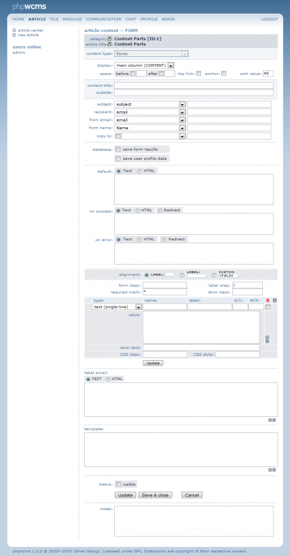
Here you can insert values for the different field types.

Beispiele:

- text (single-line)
"This is single line text"
 
- text (multi-line)
"This is a multi line text"
 
- text (special)
type=INT - only integer values permissible
type=DEC oder FLOAT - only decimal and/or float permissible
type=IDENT - Comparison test, only if input identically to the default value
type=STRING or MIX
type=DATE - examines whether valid date
type= A-Z (only upper chars)
type=a-z (only lower chars)
type=a-Z (only chars)
type=0-9 (only digits)
type=PHONE (Phonenumber)
type=WORD (Word chars)
type=LETTER+SPACE (a-Z, space, hyphens)
type=REGEX (patterns - new value: pattern
="/...regex-pattern.../")

default="100"
dateformat="m/d/Y"   -
 
- hidden
A insertion into this field will not be displayed
 
- password
No insertion necessary.
 
- email
No insertion necessary.
 
- select menu
"Apple"
"Cantaloupe"
"Pear"
 
- list menu
"Apple"
"Cantaloupe"
"Pear"
 
- checkbox
"Apple"
"Cantaloupe"
"Pear"
 
- radio button
"Apple"
"Cantaloupe"
"Pear"
- file
max. file size: maxlength="10000000"
as attachment: attachment="1"
what kind of attachment: accept="text/*"
out of which folder: folder="content/form"
exclude files:
exclude="php,asp,php3,php4,php5,aspx,cfm,js"
 
- send button
"Send request!"
 
- reset button
"Reset fields!"
 
- break
"******************************************************"
 
- break text
"This is a break text"
error text:

Insert here an error text, when the user did not fill out a field.

Bsp: "Error: The following field is empty:"

CSS style: You can also use an individual css class for this error message.
template:

Here you have to insert a template, otherwise you will be sent a blank email. This template can be created as a text template or as an html template. In the templates you can use all field names of the form.


Article created: Wednesday, 13. April 2005
Last Changes: Tuesday, 4. January 2011